
 起点课堂会员权益
 职业体系课特权
 线下行业大会特权
 个人IP打造特权
 30+门专项技能课
 1300+专题课程
 12场职场软技能直播
 12场求职辅导直播
 12场专业技能直播
 会员专属社群
 荣耀标识
荣耀标识这些UI设计中常犯的错误,你还在犯吗?
编辑导语:对于新手设计师来说,做设计难免会出错。有的错误在犯的时候并不知道,被人指出后才恍然大悟,还有很多错误因为各种原因被忽视掉了。无论是哪种情况,设计师终究都要改正并且提升才可以。本文作者为我们总结了UI设计中常犯的错误,看看你中招了多少吧!

设计源于生活,细节成就品质。
前言:这是一篇外文文章,由于近期在做B端产品,写得不错,很有共鸣所以翻译分享给大家。有些地方稍加修饰加上了自己的经验想法,同时也把原文附上了,尽可能得让大家感受原作的用意表达。
Introduction:
In my job as UX Consultant for a Mendix partner, I often come across self-organized teams creating awesome internal applications. My job involves improving the UX within their applications.
The best days are when I am completely blindsided by the ingenuity of the creative ways some problems are solved, forcing me to explain why some logical solutions are a bad idea. The solutions given by me are not a “single truth”, there are always exceptions, don’t quote me on anything written here, but use it as inspiration to start the conversation.
简介:我的工作是作为Mendix Partner的顾问,我经常会碰到组织良好的额团队做出非常不错的机构应用,我的工作就是是改善这些应用的用户体验。
这些天我完全被一些具有创造性的问题解决方式震惊到了,这促使我将要给大家解释为什么这些创造的逻辑是糟糕的。我的方案并不是唯一的真理,永远有更好的,我这里仅仅是抛砖引玉。
一、Everything in a single screen
囊括一切:
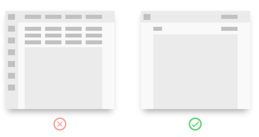
This is the most commonly implemented UX bad practice.You start your little app with a tight interface, add a couple of features and before you know it, you have a screen full of buttons. Don’t feel bad, we’ve all been there.
1. Arguments
- Less clicks
- I can see everything, creates overview
- Users hate scrolling
一个页面囊括一切:这是最普遍、最糟糕的用户体验。紧凑的界面塞满了按钮,填满了内容,整个屏都是按钮。这样做的理由是:
- 更少的点击和页面跳转
- 呈现给客户更多得内容,创造全局概览
- 用户厌恶滚动浏览
Whenever I see this interface solution it reminds me of a swiss army knife with all the tools unfolded, and the only one that is used is the bottle opener.
当我看到这样的界面使我想起了瑞士军刀,囊括尽可能多的工具,而唯一有用的是启瓶器。
2. Overwhelming 信息铺天盖地
Having all the options spread out seems like it creates overview, but the problem is that your brain can only understand 9 options at best, and let`s be honest the user probably doesn’t use 95% of the buttons that often.
所有的选项铺展在一个页面似乎创造了全局概览,但问题是大脑最多只能理解9个选项,因此用户95%的按钮都不经常用。
Millers law /弥勒定律:短时记忆期间平均能够记住的元素数量仅为7(±2)个。
3. Proximity 临近原则
Another problem is that buttons should be close to the data that they influence. Having more buttons means losing visual proximity.
另外一个问题是按钮要尽可能紧邻与其相关联的内容,呈现更多的按钮意味着失去视觉上的紧邻原则。
4. Users dont hate scrolling 用户不讨厌滚动浏览
The “users hate scrolling argument” is often a side effect of not having the right context at the right time and solving it by craming as much information in a single screen to help create context.
“but in our analytics we see that only 10% of the users scroll to the bottom of our landing page” seems like a safe bet to conclude that 90% of your audience hates scrolling.
The problem is not the scrolling, its the amount of information. Having more information higher on the page doesnt mean that users will absorb that information but will burn out quicker and make them leave.
用户讨厌滚动一方面的影响是在正确的时间没有出现正确的内容,所以才在一屏上填满更多的信息来创造内容。
在我们研究分析的结果中,只用百分之10% 的用户滚动到登陆页的按钮,由此极有可能的结论是90%的用户讨厌滑动鼠标。
其实问题不在于滚动鼠标而是信息量,把大量的信息呈现在同一个界面并不代表用户=用户都会注意到,反而会是用户失去耐心愤然离去。
二、Dropdown buttons
下拉菜单:
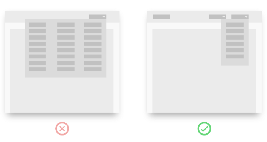
So you’ve cleaned up your screen and put all the buttons in dropdowns.
1. Arguments
- More Focus
- Less clutter, easier to find what I need
为了让页面更简洁,就把所有的按钮尽可能的放到下拉菜单里
好处是:
- 更专注
- 页面简洁,用户更容易找到他所需要的
2. Balance is key 平衡是关键
Think about your interface as a physical space, if you hide a page in a set of drawers, you need to open every drawer until you find what you are looking for. This is the same for digital UI.
If your drawers are logical and are in the right place this works well, but having garden supplies in a drawer in your garden shed sounds smart, so should your bbq supplies go in there too? Or in the kitchen? Or both?
A good balance goes a long way. How often you use your bbq determines if it should go in the shed or kitchen.
If you only have 5 buttons, they might not need to go in a dropdown, but 6 buttons, that’s a different story.
把你的界面想象成一个现实空间,如果你把一张纸放到一套抽屉里,在你找到他之前你需要打开每个抽屉,对于UI界面也一样。
但是如果你的抽屉式合乎逻辑的,并且放在了正确的地方,那这很管用;在花园小屋的抽屉里放花园用品听起来很明智,但是你的烧烤用品也应该放进去吗?还是在厨房里呢?还是两者兼而有之呢?
很好的平衡有很长的路要走,多久使用一次烧烤用品决定你是放在棚子里还是厨房里。如果你只有5个按钮,就不需要放在下拉菜单了,如果是6个,那情况有不一样了。
三、where am I
我在哪里:
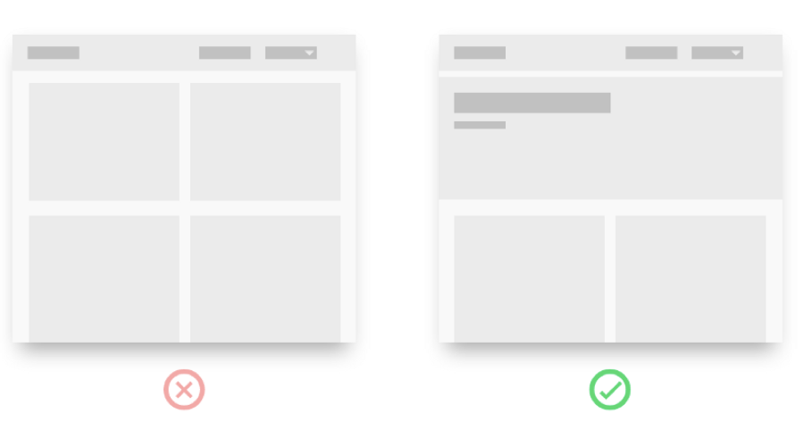
You have a consistent design system and brand style, all pages feel the same. Soon you feel like you are walking through a forest of pages, not knowing if you have seen this page before, or if this is a different page with similar states.
1. Arguments
- Consistent visual style
- Design Systems driven design
- Efficient use of screen real-estate
你有一个一致性的设计系统和品牌风格,所有的页面感觉都一样,很快你你感觉就像走在了页面组成了丛林里,不知道你当前的页面是否之前看到过,还是不同的页面有相似的状态。
你认为这样的好处是
- 一致的视觉风格
- 设计系统驱动设计
- 有效的使用屏幕
It’s friday afternoon, you have A.D.D and are bouncing between social media, colleagues, some private messages and trying to do your work. The last thing on your mind is what link you just clicked and where you are in the flow or process.
2. Create every screen for this user.
- Give pages clear headers or page names
- Implement breadcrumbs if you are more than 1 level deep
- If the flow has multiple steps, show those steps.
然后正是这样吗?
在星期五下午,你有A.D.D,在社交媒体、同事、一些私人信息之间忙来忙去,试图做你的工作。你脑海中的最后一件事就是你刚才点击的链接以及你在流程或过程中的位置,所以:
为用户按照以下原则设计界面:
- 给界面设定清晰的标题;
- 如果有不同层级就使用面包屑;
- 如果任务流有多个步骤,那么就显示出来。
四、Popup in popup
多重弹窗:
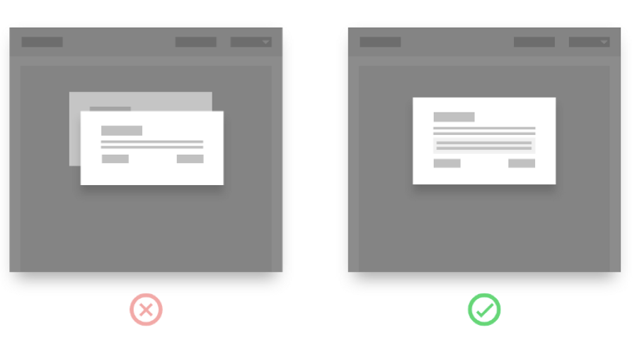
To save space, you have a button with a notification.In the notification there is a button that leads to another popup.
1. Arguments:“More context awareness”
为了节约空间给一个按钮添加了提示弹窗,而在提示弹窗里又增加了一个,增加的理由是:更多的上下文衔接意识。
2. What happens when I…
The problem with this is that the user loses his mental model of where he is in the process. If he finishes the second popup, will he go to the original popup or back to the original screen?Either the first popup should be a screen, or the second popup should be an inline error message.
这样做的会导致什么问题是用户会失去在任务过程中的心流,如果用户关闭第二个弹窗,是会回到先前的弹窗还是回到主页面呢?
这会给用户造成困惑;所以最终的解决方案是,要么第一个弹窗是一个页面,要么第二个弹窗是一个弱提示弹窗/非模态弹窗。
五、Card in card
卡片嵌套:
Cards are trending at the moment, so what could be better than a single card? how about a card in another card… mind blown.
1. Arguments:“Cards are nested to create visual hierearchy”
UXers often talk about visual hierarchy. The way in which elements are organized on a screen portraying their importance to the user. Along the way physical symbolism such as cards were introduced.
卡片设计目前很流行,还有什么是比卡片还要好的吗?卡片中的卡片又效果如何呢,神魂颠倒。
这样做的理由是:卡片嵌套能创造视觉层次结构。
UX设计师们经常谈论视觉层级结构,这样能很好的将元素组织起来把最重要的展现给用户,因此像看片这样的实体象征被引入到设计中。
2. In a traditional card deck, cards are all equal of size
Cards are placed on, under or next to other cards to communicate certain states or relationships. When you nest a card inside another card, the users mental model of what you can do with cards starts to breakdown.
The user subconsciously starts to question relationships of other objects in the interface, and all logic is thrown out the window.
传统纸卡牌尺寸都一样大,通过将卡片并排叠加传达某一状态或关系,当卡片进行嵌套,用户通过卡片建立的心智模型崩溃了。用户下意识地开始疑惑界面上其他卡片之间的关系,所有的逻辑都被打乱了。
The solution is easy though!Dont nest cards, but place them close to each other, next to each other, or placed within an outline (like laying cards down on a casino table).
解决方案很简单,不要进行卡片嵌套。而是进行平铺排列,或者置于外轮廓线内,像赌场桌上的排卡牌一样。
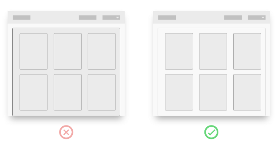
六、Form fields
表单域设计:
Should I have a long list of form inputs? Maybe break it up in to multiple steps? Or have 3 columns of form inputs so it all fits in a single screen?
1. “Users hate scrolling”
The main problem isn’t the amount of pages or the amount of forms, it is how many forms are visible on the screen at a single time. Like buttons, this should be reduced to the minimal amount possible that still gives context and ease of use.
表单域该怎么做?是罗列一整页的输入表单,还是对表单分布显示,还是在分成3栏并显示在同一页,用户讨厌滑动鼠标?
主要的问题不在于页面数量和表单数量,而是在同一时间多少个表单显示在屏幕上,就像按钮一样,在保证易用易读的前提下,也应该尽可能减少到最小数量。
2. Always use a single column
Best practise is to always put intput fields in a single colomn.The users eyes have an easy time to flow down and check off each section.
永远只用单栏显示:最佳的实践是设计一栏表单即可,这样用户视觉连续向下流动足一核对每个部分。
3. Are you telling a story 你在讲故事吗?
Sometimes your input fields are about the journey the user is about to embark on (on boarding), or maybe they have important consequences (tax slips). This is the best time to break up your fields into multiple pages.
This gives you some visual space to create some breathing room and explain to the user what they are doing and why it‘s amazing or important.
有时,如果输入表单是一系列的任务或者有不同的重要次序,那么就可以进行分页展示。
这样能带来更多的留白空间,页面也具有呼吸感;同时能让用户明白自己在做什么,什么是重要的,让用户具有惊奇感又感觉到轻松。
4. Dropdowns 下拉选择表单
If there are only 1–5 items to choose from please don’t put them in a dropdown. I know it might look elegant and all, but it’s just not worth the users effort. Placing radio buttons is a friendlier approach.
如果只有1-5个选项,就不要做成下拉式菜单,虽然会显得简洁优雅,但是用户使用起来比较费力耗时,直接像收音机按钮排列出来会是更友好的方式。
七、Recap, Quick rules
1. Recap, Quick rules
- No more than 9 buttons;
- Only use drop downs as a last resort;
- Give every page a header;
- When a page is more than 1 deep, give it breadcrumb;
- When in multiple steps, show the steps;
- No more than 9 words per line;
- Never use popup in a popup;
- Never nest a card in a card;
- Keep form fields in a single column。
2. 总结回顾:
- 按钮不超过9个,最好是5个;
- 不到万不得已不要用下拉;
- 给每个页面清晰简洁的标题;
- 当一个页面有不同层级,使用面包屑;
- 文本每行不超过9个词(这里大家酌情参考就行,中文肯定不止。占屏幕宽度一半到三分之二都是可接受的);
- 不要有多重弹窗;
- 不能进行卡片嵌套;
- 保持输入表单设计成一栏。
作者:虫二无二;公众号:看摹设
本文由 @虫二无二 原创发布于人人都是产品经理,未经许可,禁止转载
题图来自 Unsplash,基于 CC0 协议


这是什么书吗
这是一篇文章